Data is Beautiful

The image is from a [Washington Post](https://www.washingtonpost.com/business/2023/02/17/bad-southern-credit-scores/) article which took the data from an interesting research paper titled [Who Pays For Your Rewards? Redistribution in the Credit Card Market.](https://papers.ssrn.com/sol3/papers.cfm?abstract_id=4126641) The research paper is a good read. (A free PDF of the whole paper is available at the link.) It examines how the use of rewards credit cards results in a massive wealth transfer from low-credit-score customers to high-credit-score customers: >We estimate an aggregate annual redistribution of $15 billion from less to more educated, poorer to richer, and high to low minority areas, widening existing disparities. The Washington Post article attempts to frame the clear north-south split as a result of healthcare issues in the south. That explanation seems too narrow to me. This map looks too similar to maps of poverty and education, and we know health correlates strongly with both of those issues. Edit to fix a sentence fragment. Sorry; it was late and I was tired.

Link to website: https://whatif.sonycsl.it/15mincity/index.php cross-posted from: https://slrpnk.net/post/13859498 > [Related paper](https://www.nature.com/articles/s44284-024-00119-4.epdf?sharing_token=_awlBbYaejqaHNuaR5P0fdRgN0jAjWel9jnR3ZoTv0OAjaGHQUKhOauJRiRUnv5r1hH0ucDzzkn2New8DCo-iGEnuRU3ZUloKeFNMmjQeurx-b_uzcISfRCkRieuM69hKRCSNNYSqX-KfqnhHza2sRX1xjkXoDhKis7Cx0JH0PI%3D) > > I'll note that in the US, their urban area definition includes a lot of outlying and substantially unpopulated areas which fall within county boundaries; these areas tend to show up as having long travel times to services.

[Source.](https://www.statista.com/chart/24350/total-annual-household-waste-produced-in-selected-countries/?utm_souce=Blog&utm_medium=RSS)

Best of luck to Mozilla. Their line on the chart may end soon if they lose funding from Google. Source: [https://eylenburg.github.io/browser_engines.htm](https://eylenburg.github.io/browser_engines.htm)


More info https://www.nytimes.com/interactive/2022/06/22/us/shootings-police-response-uvalde-buffalo.html

Stolen from [Reddit](https://www.reddit.com/r/BSA/comments/1cngw3i/bsa_membership_graph_1911_2023/). The big drop in the 1970's was supposedly due to a change in the program to de-emphasize outdoor activities. The step down in 2019 was the LDS church cutting ties and starting their own program. If you consider this as a proportion of the population it's an even bigger drop. In 1970 there were about 4.8M scouts in a population of 205M, so about 2.3% of all Americans were in Boy Scouts. Now it's 1M scouts in a population of 341M, so only 0.3% of Americans are in Boy Scouts.

Source: [https://www.census.gov/library/visualizations/2018/comm/acs-5yr-poverty-all-counties.html](https://www.census.gov/library/visualizations/2018/comm/acs-5yr-poverty-all-counties.html)


cross-posted from: https://sh.itjust.works/post/23749463 > Source: https://www.pewresearch.org/short-reads/2024/08/15/a-growing-share-of-us-husbands-and-wives-are-roughly-the-same-age/

Source: https://twitter.com/mediazona_en/status/1823670620065808557

▶️ Total olympic medals won in Paris 2024 and Human Development Index 🏅 [@dataisbeautiful](https://lemmy.world/c/dataisbeautiful) ➡️ [https://www.businesstimes.com.sg/opinion-features/what-olympic-medal-table-really-tells-us](https://www.businesstimes.com.sg/opinion-features/what-olympic-medal-table-really-tells-us) After reading the article we made this [#boxplot](https://floss.social/tags/boxplot) using [#LabPlot](https://floss.social/tags/LabPlot), an open source data analysis and visualization software. The plot doesn't provide answers, it rather invites some thinking. [\#Olympics](https://floss.social/tags/Olympics) [#Olympics2024](https://floss.social/tags/Olympics2024) [#France](https://floss.social/tags/France) [#China](https://floss.social/tags/China) [#USA](https://floss.social/tags/USA) [#UnitedStates](https://floss.social/tags/UnitedStates) [#UnitedKingdom](https://floss.social/tags/UnitedKingdom) [#UK](https://floss.social/tags/UK) [#Brazil](https://floss.social/tags/Brazil) [#Australia](https://floss.social/tags/Australia) [#Japan](https://floss.social/tags/Japan) [#Italy](https://floss.social/tags/Italy) [#Canada](https://floss.social/tags/Canada) [#Germany](https://floss.social/tags/Germany) [#Italy](https://floss.social/tags/Italy) [#Netherlands](https://floss.social/tags/Netherlands) [#DataAnalysis](https://floss.social/tags/DataAnalysis) [#DataScience](https://floss.social/tags/DataScience) [#OpenSource](https://floss.social/tags/OpenSource) [#FOSS](https://floss.social/tags/FOSS)

Graph via [Data is Beautiful on Reddit](https://www.reddit.com/r/dataisbeautiful/comments/1en5kge/oc_the_influence_of_nonvoters_in_us_presidential/)

This chart has been floating around, and I find it interesting to speculate about the reason for this shift. Have attitudes changed this much? Do teens have less independence or fewer places to go to do these things? Are parents more involved in teens' lives? Was vaping excluded in the study?

Source: https://www.reddit.com/r/dataisbeautiful/comments/1e7cy2x/mambo_no_5_was_released_25_years_ago_how_have_the/ Source OP's comment: >Source: birth rates in the US, from social security card applications. Provided by [SSA.gov](https://www.ssa.gov/oact/babynames/background.html). For the age ranges, we make the assumption that all women lived to exactly 73 years old, which is the life expectancy for females at birth in 1960. Therefore, the population in each age range will not be entirely accurate, particularly for 69+, but it nonetheless shows the trends of birth rates and popularity of these names over time. Tools: python, pandas, Vega>


https://geoffboeing.com/2018/07/comparing-city-street-orientations/

!dataisbeautiful@mander.xyz
 slrpnk.net
From [Our World in Data](https://ourworldindata.org/food-choice-vs-eating-local)
 lazysoci.al
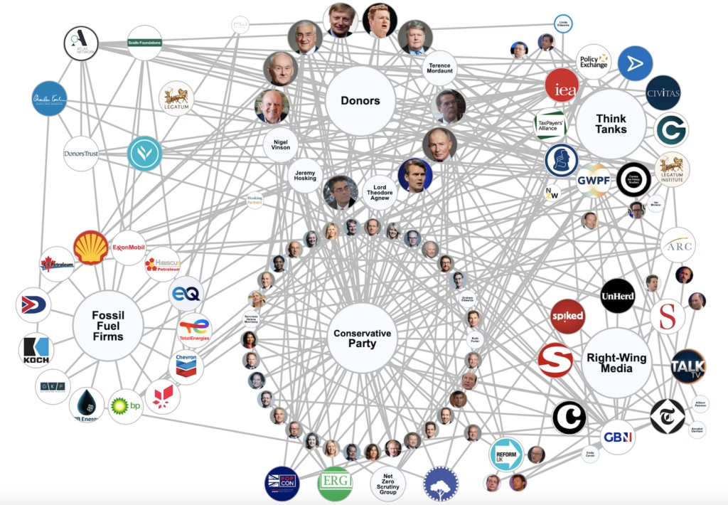
cross-posted from: https://lazysoci.al/post/14613068 > Source: https://www.desmog.com/2024/06/12/mapped-tory-network-climate-denial-fossil-fuel-funding/

https://web.archive.org/web/20240518061606/https://kaks.fi/wp-content/uploads/2024/05/tutkimusosio-18052024.pdf Finland dataset Edit: final update for the viz, [comments started with this](https://lemm.ee/pictrs/image/9c72d986-89d2-4eae-adf3-89386f81e393.webp?)
cross-posted from: https://jlai.lu/post/6262433 > Airline Incidents: How Do Boeing and Airbus Compare?
 ourworldindata.org
cross-posted from: https://lemmit.online/post/2699114 > Life expectancy vs healthcare spending of US compared to other developed countries > > ##### This is an automated archive made by the [Lemmit Bot](https://lemmit.online/post/14692). > The original was posted on [/r/dataisbeautiful](https://old.reddit.com/r/dataisbeautiful/comments/1c740ak/life_expectancy_vs_healthcare_spending_of_us/) by [/u/dolekanteel](https://old.reddit.com/u/dolekanteel) on 2024-04-18 15:57:43. >

cross-posted from: https://lemmit.online/post/2699112 > ##### This is an automated archive made by the [Lemmit Bot](https://lemmit.online/post/14692). > The original was posted on [/r/dataisbeautiful](https://old.reddit.com/r/dataisbeautiful/comments/1c732sv/oc_seven_jurors_have_been_selected_so_far_for_the/) by [/u/JPAnalyst](https://old.reddit.com/u/JPAnalyst) on 2024-04-18 15:16:16. >

[Source](https://itep.org/whopays-7th-edition/)

https://bsky.app/profile/luckytran.bsky.social/post/3kps32vsbps2y https://twitter.com/luckytran/status/1778090750107853015/
 cdn.bsky.app
cross-posted from: https://feddit.uk/post/9722518 > > If you are aged 30 or more, then 50% of all human fossil fuel emissions happened during your lifetime. (by Neil Kaye) > > Source: https://bsky.app/profile/infobeautiful.bsky.social/post/3kopcy5lddn2e


How do you measure the economic success of a country? By one classic measure, GDP per capita shows individual economic prosperity. But comparing countries simply by this metric doesn’t tell the whole story. To get a better idea of living standards, it helps to look at how far your money will go along with adjusting for labor productivity. This graphic shows the world’s richest countries by three different measures, based on data from The Economist and Sondre Solstad. All figures are in U.S. dollars.

The graphs are from the US Energy Information Administration's Hourly Electric Grid Monitor: [https://www.eia.gov/electricity/gridmonitor/dashboard/electric_overview/US48/US48](https://www.eia.gov/electricity/gridmonitor/dashboard/electric_overview/US48/US48) The date format in the titles is month/day/year, but in the horizontal axes it's day-month-year. I apologize in advance.

Based on https://privacytests.org **Desktop browsers** in their current stable versions, sorted from better (left) to worse (right). These are: Librewolf, Mullvad, Brave, Tor, Safari, Chromium/Ungoogled, Firefox, Edge, Opera, Vivaldi, Chrome. **Note:** Each test is counted with a value of one in this chart, however each test may not have an equal importance in regard to privacy. It still gives an image of which browsers value privacy and which do not. The maximum (worst possible) score is 143. Edit: Also FUCK BRAVE. But for other reasons than these points. Read the description before you vote or comment ffs...
Data is Beautiful
!dataisbeautiful@lemmy.worldA place to share and discuss visual representations of data: Graphs, charts, maps, etc.
DataIsBeautiful is for visualizations that effectively convey information. Aesthetics are an important part of information visualization, but pretty pictures are not the sole aim of this subreddit.
A place to share and discuss visual representations of data: Graphs, charts, maps, etc.
  A post must be (or contain) a qualifying data visualization.

  Directly link to the original source article of the visualization
    Original source article doesn't mean the original source image. Link to the full page of the source article as a link-type submission.
    If you made the visualization yourself, tag it as [OC]

  [OC] posts must state the data source(s) and tool(s) used in the first top-level comment on their submission.

  DO NOT claim "[OC]" for diagrams that are not yours.

  All diagrams must have at least one computer generated element.

  No reposts of popular posts within 1 month.

  Post titles must describe the data plainly without using sensationalized headlines. Clickbait posts will be removed.

  Posts involving American Politics, or contentious topics in American media, are permissible only on Thursdays (ET).

  Posts involving Personal Data are permissible only on Mondays (ET).
Please read through our FAQ if you are new to posting on DataIsBeautiful. Commenting Rules
Don't be intentionally rude, ever.

Comments should be constructive and related to the visual presented. Special attention is given to root-level comments.

Short comments and low effort replies are automatically removed.

Hate Speech and dogwhistling are not tolerated and will result in an immediate ban.

Personal attacks and rabble-rousing will be removed.

Moderators reserve discretion when issuing bans for inappropriate comments. Bans are also subject to you forfeiting all of your comments in this community.
Originally r/DataisBeautiful